Your users first
Who's using it, what they're trying to do and where they trip up. I did Google's UX courses on empathising, defining and ideating, and I use that process.
Most AI-built apps look the same because nobody overrode the defaults. I override them. Deliberate colour and type, layouts that were chosen rather than accepted, and flows that make sense to the people using them.
I design and build interfaces for Base44 and AI-built apps. Real design decisions instead of the defaults, so your app looks like someone actually thought about it.
Who's using it, what they're trying to do and where they trip up. I did Google's UX courses on empathising, defining and ideating, and I use that process.
Colours, type, spacing and components that work together, so the next screen you add still looks like it belongs.
Tap targets you can hit, text you can read, focus states that show up and keyboard support that works.
Small animations that explain what just happened. Nothing that makes you wait, and it calms down for people who prefer less motion.
I design and build, so nothing gets lost in a handover between a mockup and the real app.
Five steps, in this order. You see progress at every one of them.
Step 01
I go through your app the way your users do and write down everything that's confusing, slow or ugly.
Step 02
We agree the look and feel on a few key screens before I touch the rest.
Step 03
Tokens, components and patterns, built into the real app, screen by screen.
Step 04
Phones, tablets, keyboards, reduced motion and contrast. The bits nobody tests.
Step 05
Notes on how the system works, so you can add new screens without it drifting.
What people said
Read every reviewHis UI work is some of the best I've seen, and he's prompt, helpful, and genuinely invested in getting things right.
He doesn't put you in mind just as a client, he puts your users in mind and is able to bridge the wonderful balance and thoughtfulness of design and core competencies with his full stack knowledge.
What I've built
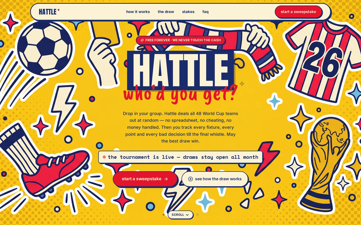
Brand, design and build: a sticker-wall look, sketched on paper and shipped in 8 hours.
Read the case study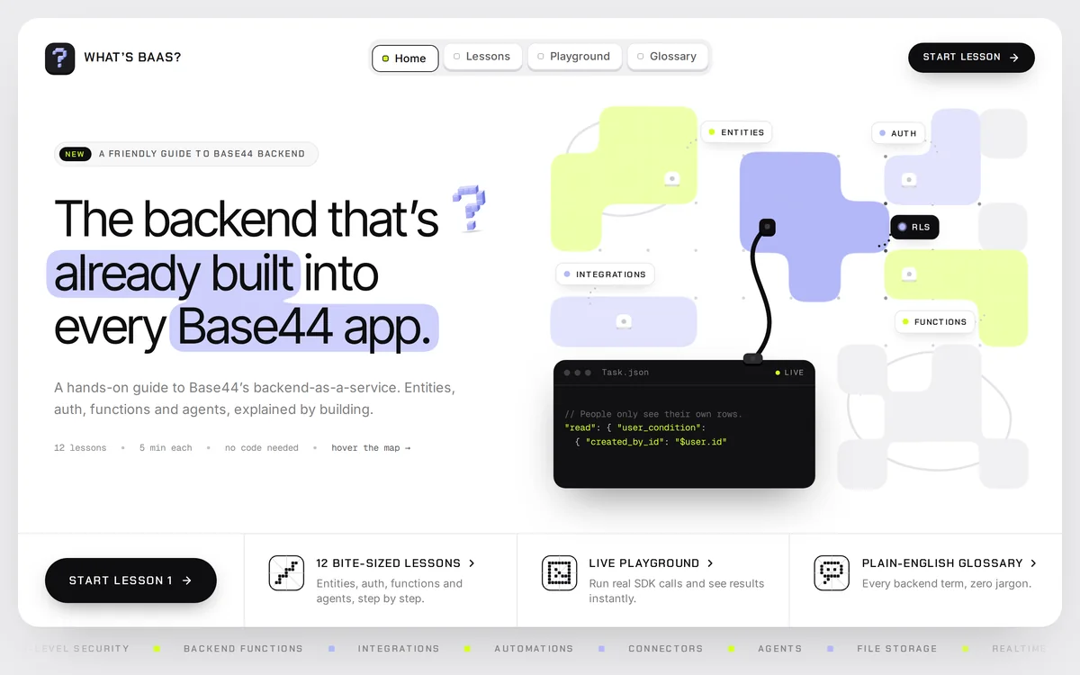
Base44's backend drawn as a map you can hover, with a playground that prints a receipt.
Read the case studySomething else on your mind? Ask me. I answer everything myself.
Ask a questionYes. I work inside your existing Base44 app, screen by screen, so the look changes without starting again from scratch. We agree the direction on a few screens first, so there are no surprises.
Mostly I design and build together, because that's where the design survives. If you really need design only, tell me what you've got and I'll tell you straight whether it makes sense.
Because the builder has a house style, and if nobody overrides it, you ship the house style. Same gradients, same cards, same centred hero. Fixing it is mostly about making decisions on purpose: type, colour, spacing and layout.
That's fine. We can pick a direction together: a few colours, a type pairing and some simple rules. It doesn't need to be a huge brand project to look intentional.
Full-stack Base44 apps, built properly from the data up.
Faster pages that search engines and AI answer engines can read.
Stripe, Resend and third-party APIs, wired in and working.
Send me a link and tell me what's bugging you about it.


